Logo and visual identity
See and download the Nysse logo and discover the visual identity elements.
Nysse logo and visual identity
Nysse logo
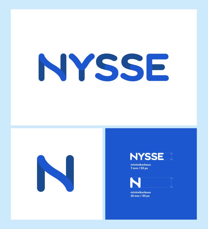
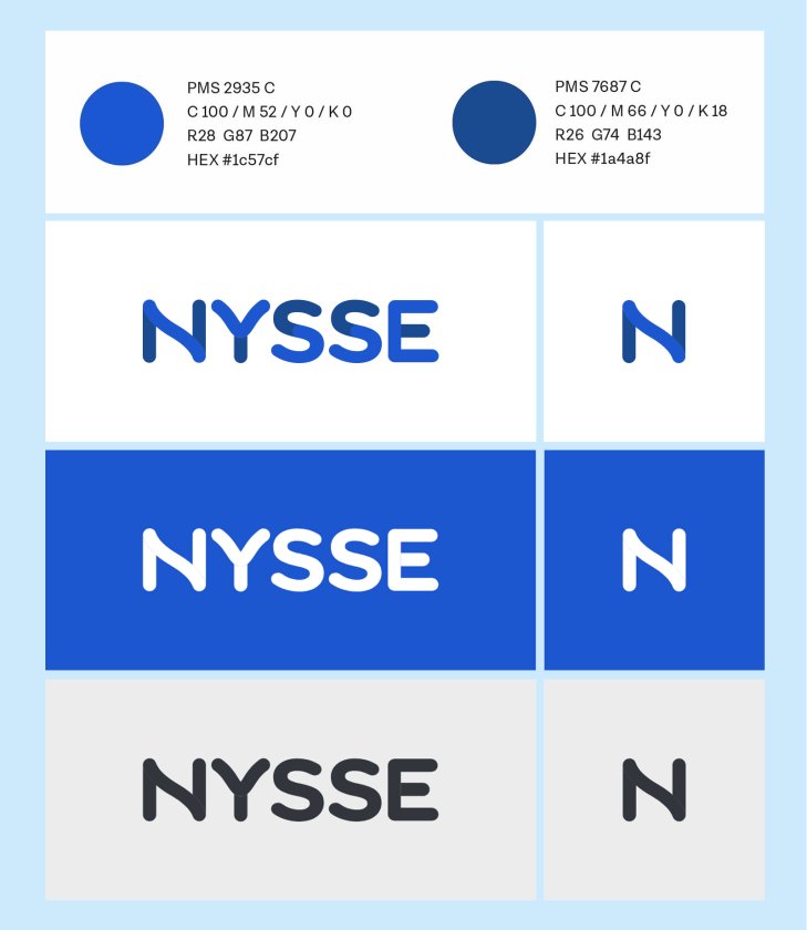
The mobility services in the Tampere region are known as Nysse. The Nysse logo symbolises modern forms of urban transport, combining means of transport and routes into a smooth journey. The Nysse logo is always used as the primary logo on materials.
To make Nysse stand out as clearly and impressively as possible, even in small spaces, the letter N derived from the logo is used as an alternative symbol.
Protected area
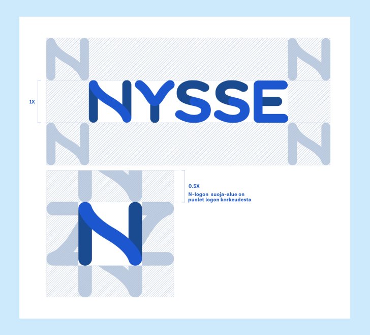
To ensure the distinctiveness of the logo in all situations, a protective area must be left around the logo. The width and height of the protected area are determined by the height of the letter N in the Nysse logo in relation to the size of the logo.
No text, photographs or other elements may be placed within the protected area. The protected area must also be taken into account if the logo is placed close to the edge of the base.
The colours of the logo
The Nysse logo is primarily displayed in two colours, blue or negative white.
The black Nysse logo is used with caution and only in applications where colour reproduction is limited or is reproduced in monochrome black.
The logo should stand out from its surroundings and should not be used on multicoloured surfaces. The Nysse logo is preferably used in 4 colours on a white or as light background as possible. If the background colour is blue or any other colour, a white version of the logo will be used.
When using the logo on different coloured or pictorial surfaces, sufficient contrast between the logo and the background must be taken into account. In four-colour publications, the logo is never used in full black.
Use of partner logos and the Nysse logo
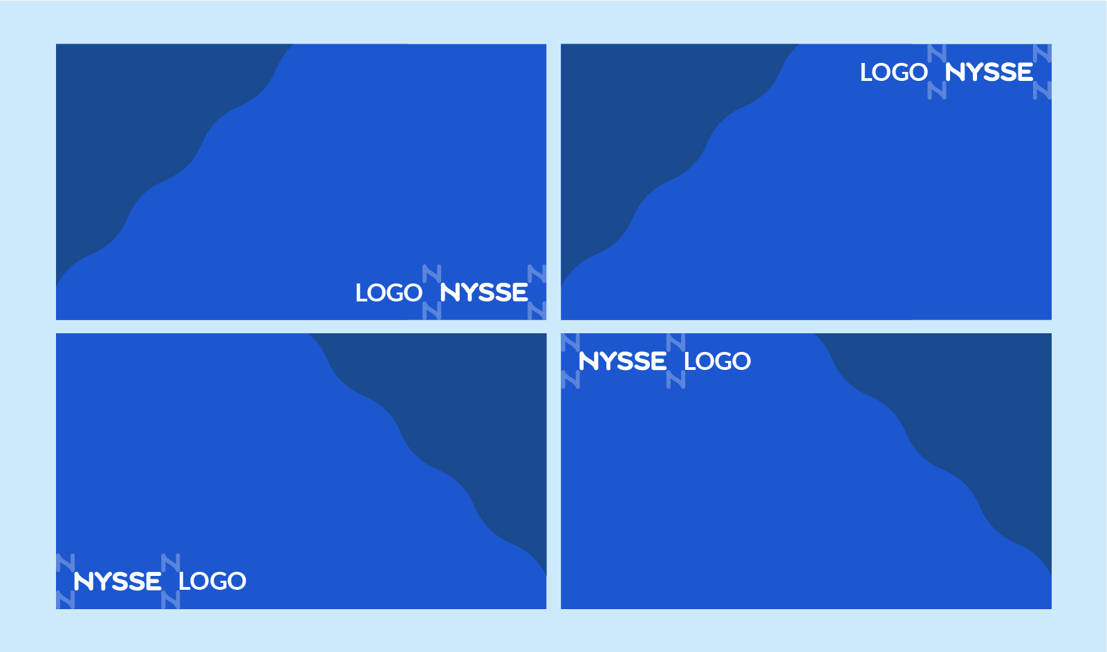
The Nysse partner logo may appear either before or after the Nysse logo. The width of the letter N in relation to the size of the logo defines the protection zone that separates the two logos. The Nysse and partner logos must be of the same size.
Slogan in the context of the logo
Nysse's slogan or key message is With you all the way. The key message and the derived tag #WithYouAllTheWay are used in combination with the Nysse logo as follows:

Colours
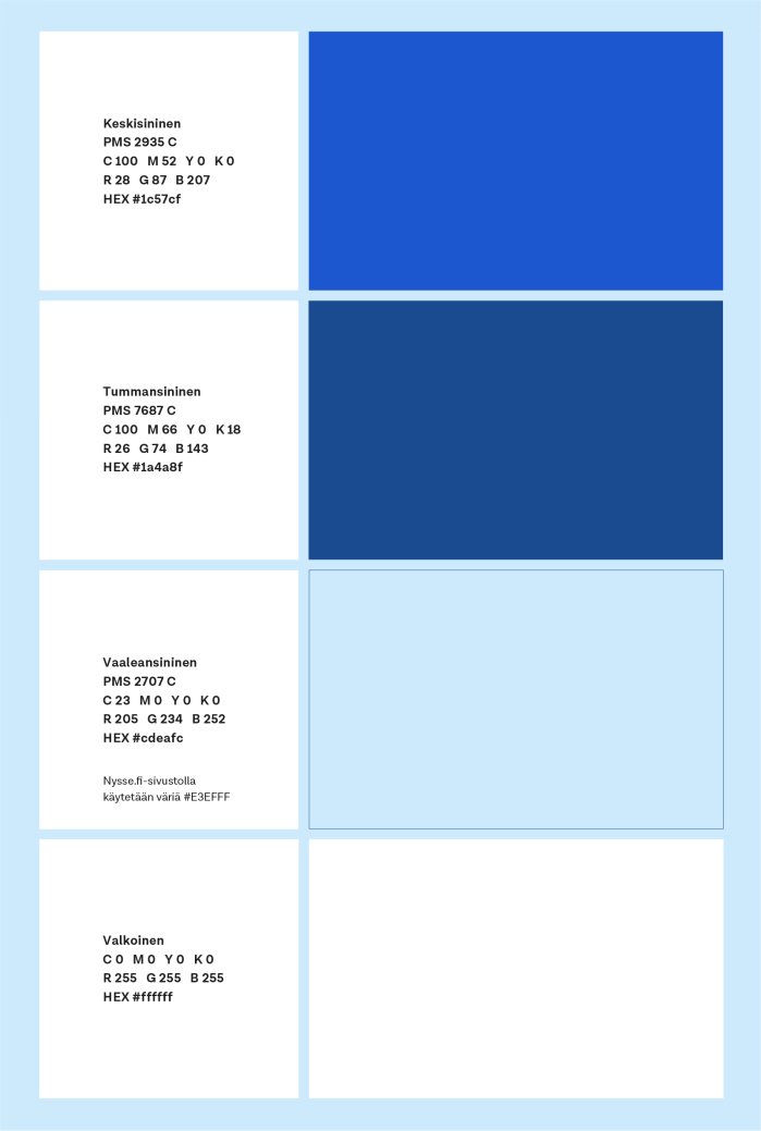
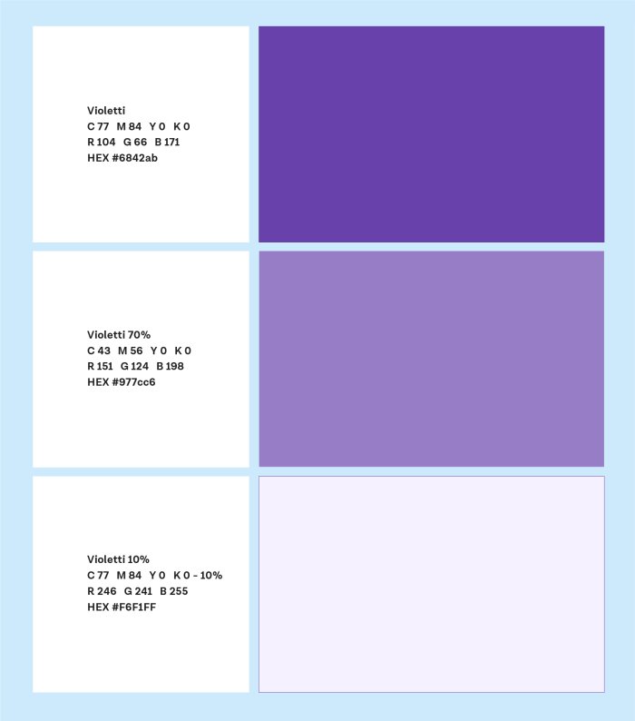
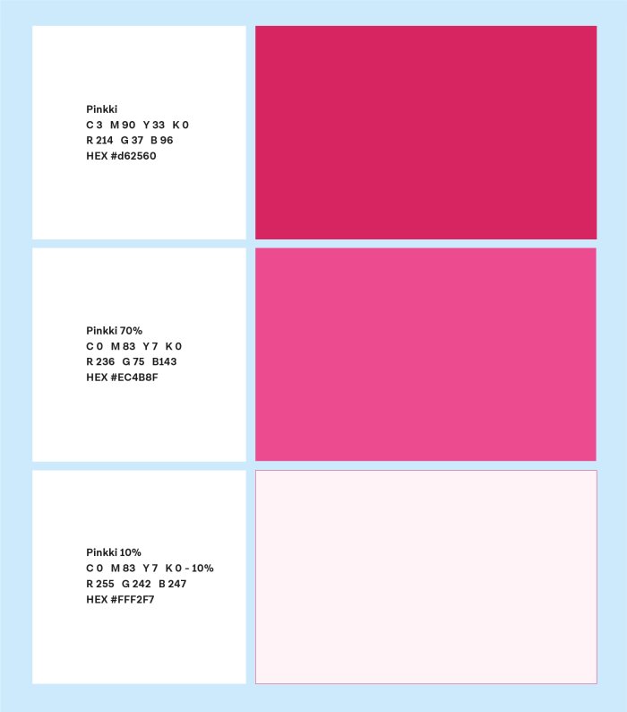
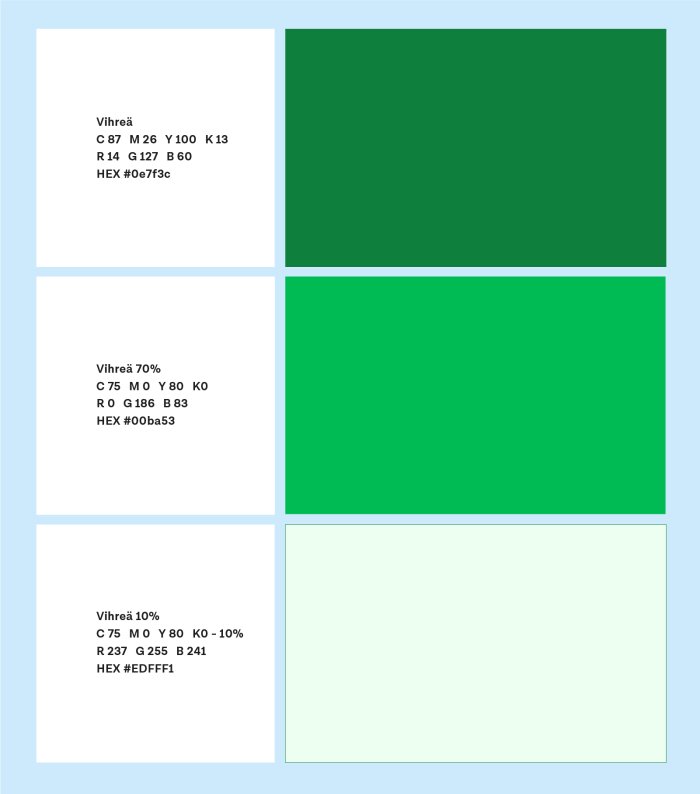
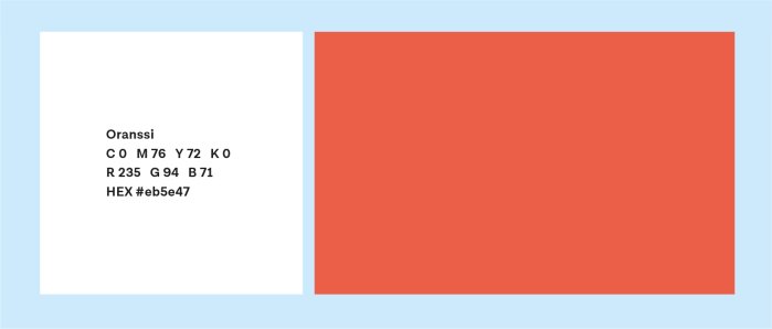
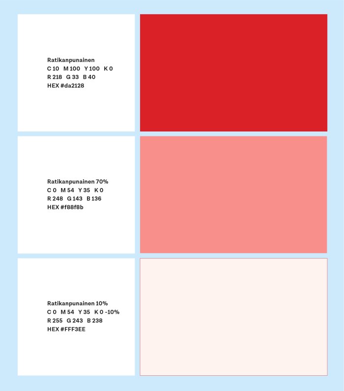
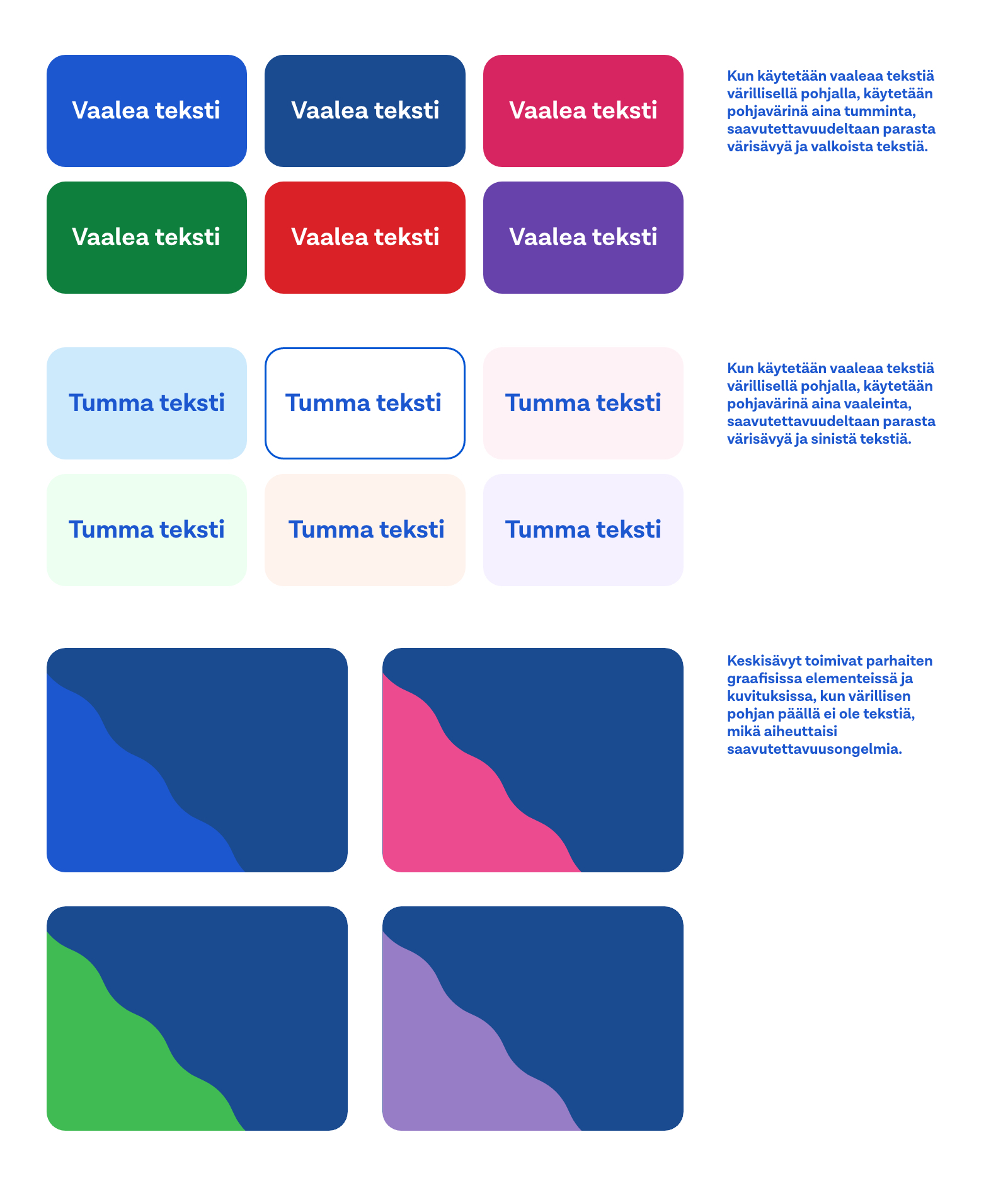
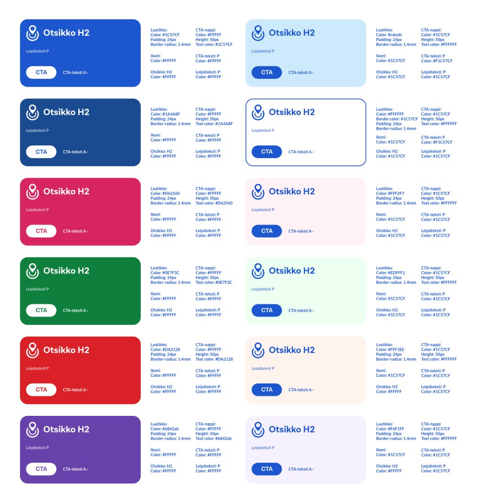
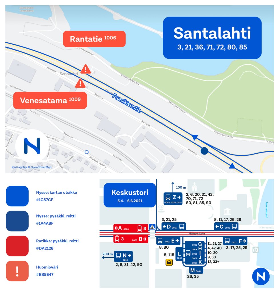
The colour palette of Nysse's visual identity consists of primary colours and complementary colours. In addition to blue, light shades should always be used on the basic surfaces of Nysse's visual identity.
These colour values follow commonly used standardised colour profiles. For printed products, Pantone® shades are used as the primary reference. In general, CMYK process colours may also be used for printing on paper if the use of PMS colours is not possible. RGB and HEX values are used in digital publications.
Typography
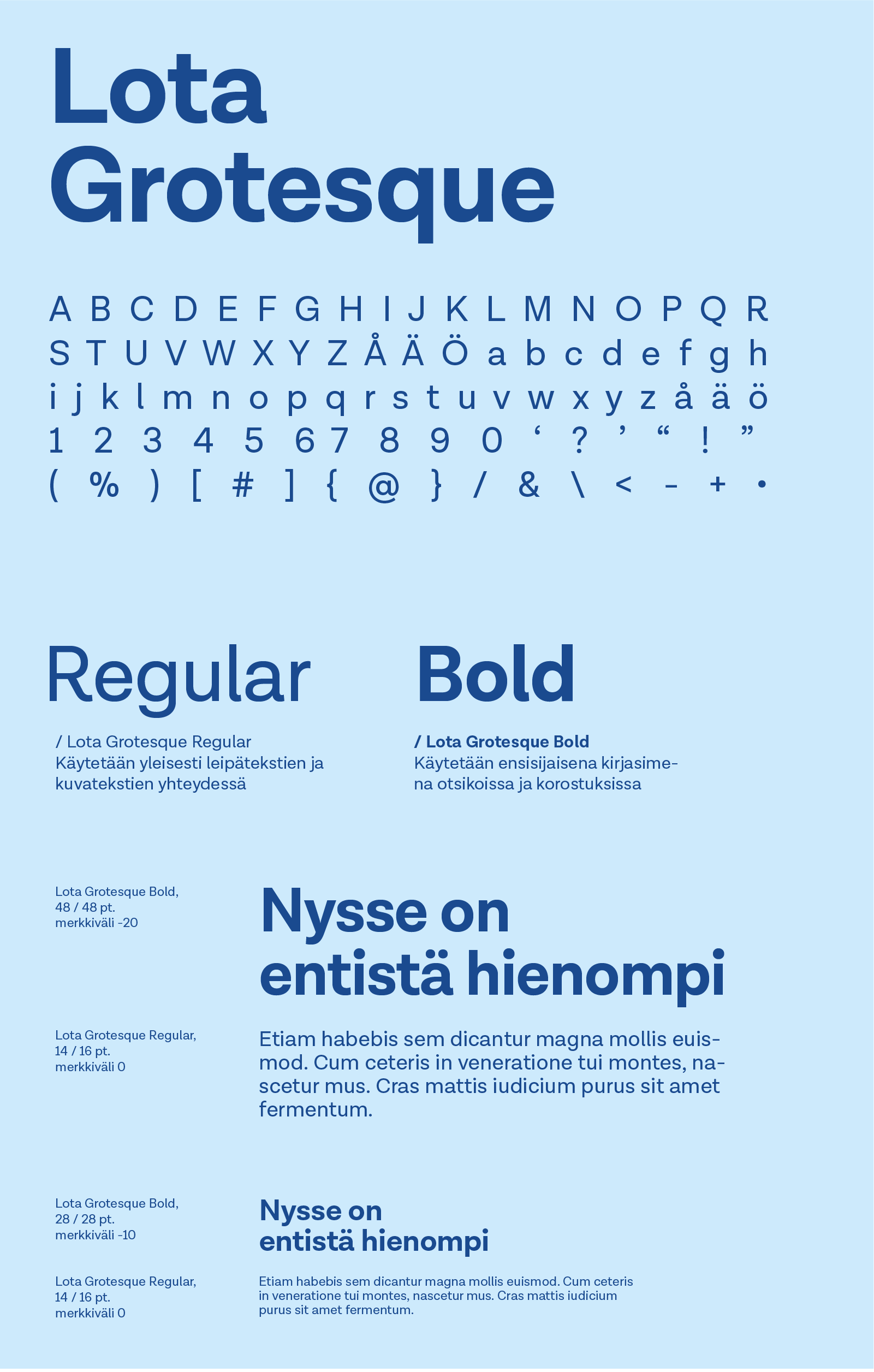
Along with the logo and colour palette, typography, as defined by Nysse, is an important basic element of communication, the consistent use of which creates a recognisable look for the written message. The indecisive Lota Grotesque typeface is used as part of Nysse's visual identity in marketing materials, signage and digital publications. Lota Grotesque supports Nysse's communication regardless of the application.
Pictograms
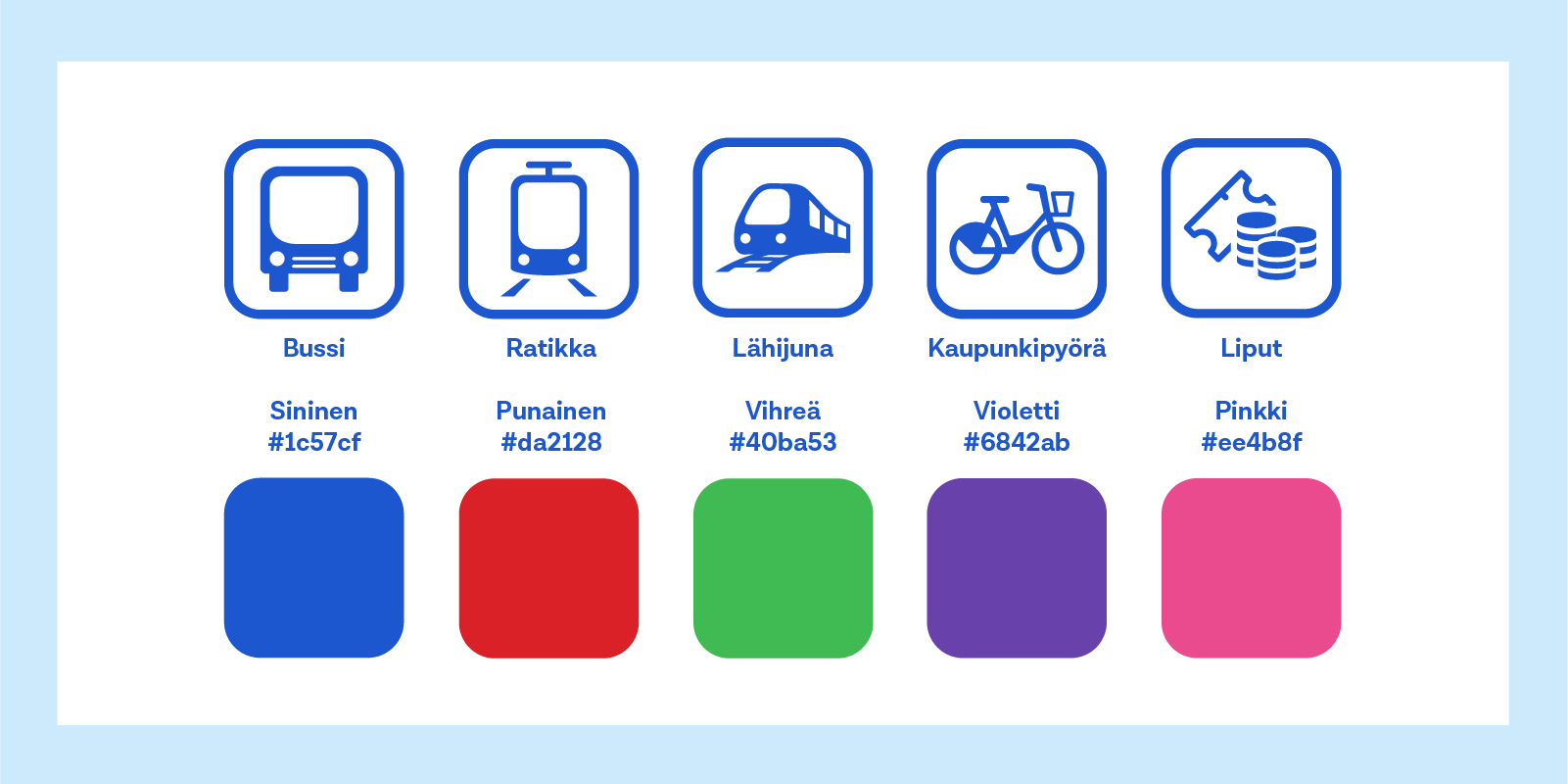
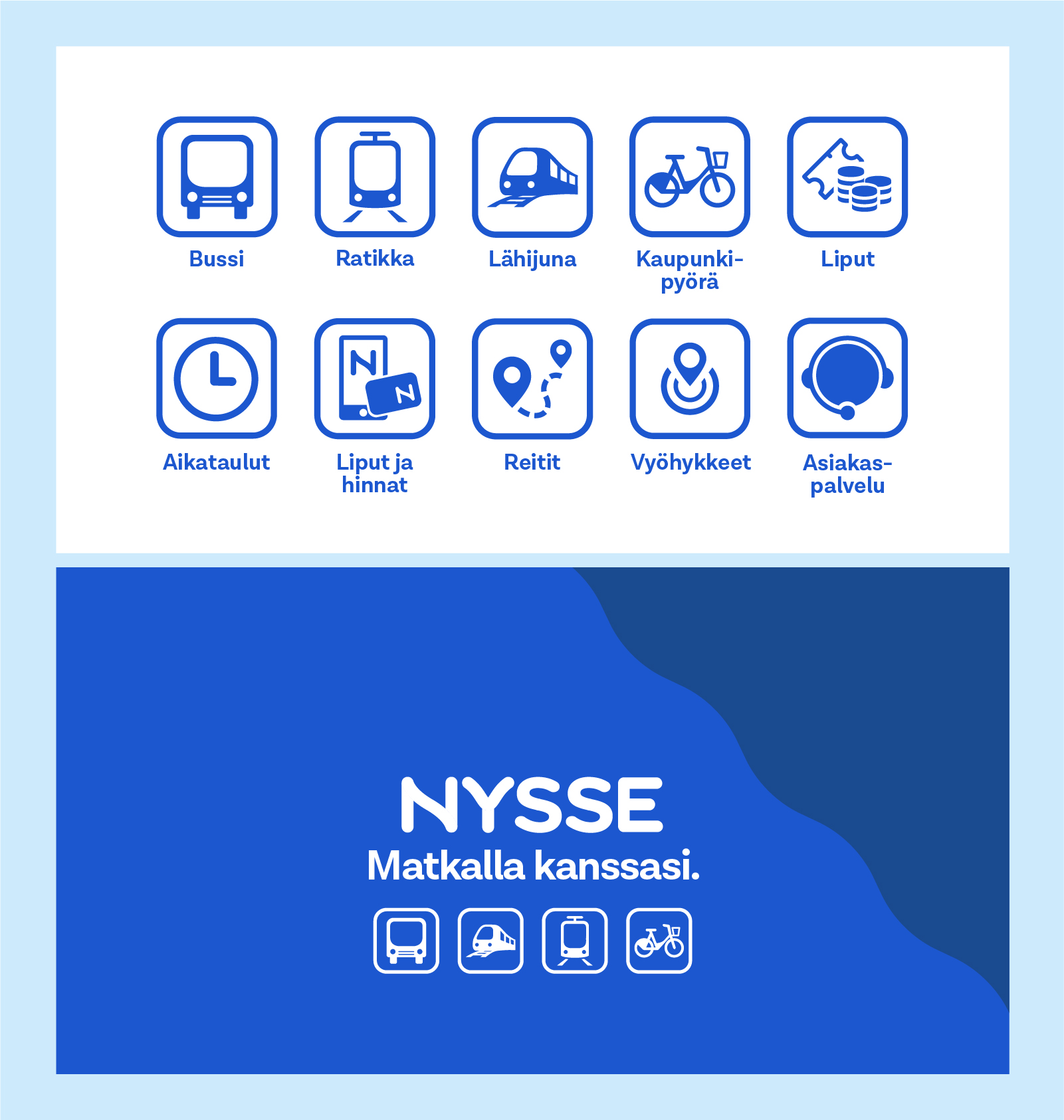
Pictograms are used to clarify a message or show context. An icon and a background frame make up a pictogram, which can also be used without a frame or background, for example as part of a larger background. Pictograms may not be strengthened or thinned and are always white or Nysse blue in colour. Pictograms should be used with discretion. The pictograms in the image are examples from the Nysse pictogram library.
Graphical elements
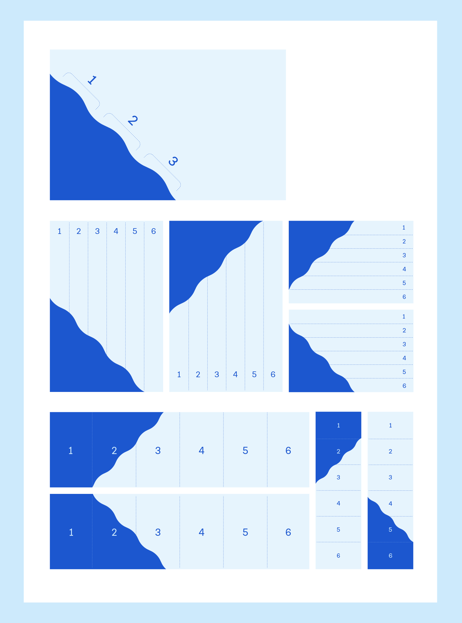
The Nysse graphic element is the wave angle, which is derived from the Tammerkoski shape found in the Nysse logo. The wave angle is always at an angle of 45 degrees and the wave should be represented by three wave crests. The wave angle can be located in the upper left or lower left corner of the data.
In the default situation, the shorter side of the data is divided into six equal parts, of which the angle covers five-sixths. An exception to the layout is where the longer side of the base surface is more than twice the length of the shorter side. In this case, the longer side is divided into six equal parts, of which the shape of the wave completely covers the first sixth of the base surface.
